A tremendus amount of shots were used and these were the highlight of
the whole video, for each shot there was a reaction shot or a shot from
another angle which made the video much more interesting to watch and
more professional. I think shot in the supermarket i believe was the
best, the bright colours of the shop looked great on camera and the hint
of voiurism made it look incredibly professional.
The only thing
i think could be improved would be the link between the music and the
video. At times in the music track there would be a peak i.e. "and
through it all (all is where it peaks) he offers me protection". This
really strong part in the songand seemed a bit out of touch with what
was going on in the video. I think would have looked fantastic if you
had of filmed some "epic" shots for which you could sync with the audio.
I had in mind someone dropping to their knees, flinging their arms out
and looking up to the sky for this would amplify the really significant
part in the song.
I really liked the actual concept of
the music video of having an angel in real life situations who no one
actually notices or cares for, and following her completing a normal day
but seeming to be agitated and annoyed about herself. (hopefully i got
this right? haha)
I think the idea was great and obviously worked
well due to the fantasic product. The factor which helped this alot was
that none of the normal people actually looked up or stared. I think
this was down to the perfect costume choice of not over doing it and
keeping her looking normal.
The video is put together
very well and this is its strong point, however i think that one of the
main problems i have, related to the music and video link i mentioned
earlier, was how the audio didnt sometimes work with the video. This can
be seen on in the already mentioned places and any of the vocal parts
where the lyrics were very soulful but is accompanied by pretty normal
video footage. This one picky problem i feel your video has could be
fixed with much more clips of artist singing and a bit more time spent
syncing the clips with audio parts. Other than that minor issue i think
its GREAT :D
Wednesday, 30 November 2011
examples of a commentary
^^^^
This clip is an example of a directors view of the making of a music video, although it is not conventional, as it is not in the form of a voice over i think that is is a very modern and more interesting take on it, because it has both the music video in it, behind the scenes shots and the directors decisions in it, although he does not explain them.
what is a directors commentary
A directors commentary is a video or voiceover featuring the director of a music video, film or television programme. It discusses the directors choices and decisiions into everything to do with the text. The reason behind these comentaries is to get the veiwer to think more about the media text and appreciate the decisions made and almost analyse them further, it also gives the director the opportunity to evaluate his work. It is more often than not in either a voice over or mini clip format, so that the commentary can be shown alongside or over the top of the text so that the audience can hear and see both, in order to understand the directors explainations.
Directors Commentary Analysis: The Mummy
The commentary includes Stephen Sommers (writer/director or The Mummy) and Bob Duscay (editor)
The film also includes another commentary by Actor Brendan Fraser.
They overlay the voices over the film as you watch.
-Stephen starts really casually and introduces himself as Stephen Sommers, telling the audience 'its really Steve' but his mother makes him use his formal name. I think this is a nice way of starting as he wins over the viewer by revealing something about himself and the two joke between them.
-They talk about how much the movie cost, what kind of atmosphere they wanted to create and what they like about different camera shots.
-They run through the various effects they used and list the problems involved with the editing and mention the practical effects used like the rising of the sand.
-They pointed out little flaws and talked about lighting problems and clothing malfunctions.
-They talk about what scenes they had to cut out for different reasons like timing and pace and not wanting to reveal everything too soon.
-They revealed that the scene where eve was standing on the ladder was a stunt man in drag, and they used the same room to play a different one in the film later on.
-They talk about how important light is in the film and in the desert scenes they had a filming window of 4am - 8.30am.
-Used a professor to keep things as factual as possible, the professor also taught the actors ancient egyption with cassette tapes.
The whole commentary was really informal, and because it felt like a conversation the audience can feel involved - over all really enjoyable.
Directors Commentary Research
A directors commentary is used in various media products such as music videos, adverts, video games, tv series and more commonly films.
A directors commentary can include the director, cast membors, writers and the producers. Some commentaries may even include film critics or historians depending on the type of film.
Types of commentary:
-Partial / scene specific commentary: only covers selected scenes of the movie/music video.
-Feature length / screen specific commentary: recorded in one session, the speakers watch the movie/music video all the way through and comment on it during.
http://www.ratethatcommentary.com/top100.php
http://www.filmcritic.com/features/2008/07/the-best-and-worst-dvd-commentary-tracks/
the links above are both sites that have rated various directors comentaries.
Tuesday, 29 November 2011
Promotion- Facebook page

I decided to create a fan page to support and market the artist and album, on the facebook page i uploaded the magazine ad, and the album cover, so that fans on facebook can keep up to date with the artist. i think this is a very modern and effective form of promotion and use of technology.


Monday, 28 November 2011
analysing original video
Robbie Williams- Angels
We purposely decided not to watch this video before making our music video for the same song, because we didnt want to get any ideas from it and make it too similar, however because of goodwins theory being applied to both they have turned out fairly similar.
Goodwins theory
Music videos demonstrate genre characteristics (e.g. stage performance in metal video, dance routine for boy/girl band).
This song is a pop/ ballard song, it conforms to conventions by having performance shots, of robbie singing at the camera, also, because it is a fairly soft and slow ballard, the use of black and white effect aids this.
There is a relationship between lyrics and visuals (either illustrative, amplifying, contradicting).
the visuals do not illustrate the lyrics of the song, however they are not completely contradicting, because they do illustrate the storyline and the lyrics as a whole, because they have a narrative about a girl and him loving her, and the visuals do support this.
There is a relationship between music and visuals (either illustrative, amplifying, contradicting)
the relationship between the music and the visuals is amplifying as the cut rate is very in tune with the tempo of the music, as the beat quickens there are more different shots and they also change on the beats, whereas when the music isnt as fast, there are very few shots that are quite long.
The demands of the record label will include the need for lots of close ups of the artist and the artist may develop motifs which recur across their work (a visual style).
there are lots of close ups of robbie in this video and he is depicted as the main focus of the video, be is also shown to be riding a big motorbike, which shows his masculinity, this could be a demand of the record label to support his sexual image to the female audience.
There is frequently reference to notion of looking (screens within screens, telescopes, etc) and particularly voyeuristic treatment of the female body.
Robbie often talks straight into the camera, looking at the audeince, also the idea of voyeurism is there, as the camera looks at robbie and the female character through the netball game, so it is as if we shouldnt see this and they are being spied on.
analysis of a student digipak

Although i like this digipak and it is effective i think that it could be better, for instance, the use of white writing on a white background doesnt stand out very well, and the front image isnt very striking, i think it would look better reversed so that the paint image was on the front cover. also although it links to the music video as it is a still from it, it doesnt associate as much with the magazine advertisment because the font doesnt follow a house style.
analysis of a student Magazine ad

The Name of the Artist - Feist
The Name of the Album - i feel it all
Where its available - Hmv
Record Label Branding - Universals
the image on the advert also links to the music video, as it is a still from it, this is effective because the image is memorable and the audience will remember it from the video.
Sunday, 27 November 2011
student digipak cover analysis

The digipak cover features what appears to the lead singer from torso upwards semi facing the left. He's wearing headphones which suggest he is involved with music and the focus on him is concentrated as the background is completely black, edging softly around his outline. The asrtists name is positioned top centre of the image and the bold metalic looking font draws the viewers attention, and like various other examples the title of the album is directly under the artists name in smaller font. They have included where the album is available in the bottom left hand corner with the logo's of 'hmv' and 'play.com'. Filling the gap on the left side, they have added when the new album is released plus two reviews of the album.
The digipak cover as a whole gives the impression the singer is quite urban, indicated by his attire and headphones.
digipak poster analysis

The image is a close up of a male and female holding hands, as a representation of the ablum and artist it suggest his songs are about love or relationships. Aiding this suggestion is the colour effect that emphasizes the colour red and highlights certain features such as the red nail and cardigan on the female, the red shirt sleeve on the male and various tones in the out of focus background behind.
Wednesday, 23 November 2011
2nd photo shoot idea.
Because the digipak photos have to relate to the album as a whole rather than just linking completely to the music video, our second shoot will involve close up shots of Holly's face for the front cover of the digipak.
We'll use the white room to have a blank background, and this angelic view of holly's face looking innocent and natural will link to the video of Angels but will also keep the concept of being angelic through out the album.


Overview of First Photo Shoot
Our first photo was on Monday 21st November where we went to Isleham for the Church. We started by photographing with a slow shutter speed with Bekki standing behind her with two torches drawing wings around her. This effect worked really well and we felt that it was a really strong image for our digi pak.

When we got back into the classroom and started editing this picture for our digi pak we realised it doesn't necessarily go with our video as it is not set at night and the photo is quite dark. We also thought that as this image is strongly based around angels we may need to add something as we are trying to sell an album not just the video or the song Angels. As we still really liked the image aboth we decided to use in on the back of the CD cover with the track listing going down around the wings.
We then tried getting the effects of cars driving pass and Holly. This effect worked slightly however all of the photos looked slightly blury or weren't a good photo of Holly. Also the background didn't looked great as it was of a house with its lights on. We therefore decided not to use any of these photos.

The last location that we used were at the Church with the light shining onto it. We used this location in the video at the end to symbolise the ending. We thought that the light shining up on the church makes a good shadow of her and the wings. We liked these photos however felt that they didn't fit with the theme of the video as its quite dark. However we may crop out just Holly and use her lite up as part of the digi pak.

Tuesday, 22 November 2011
Examples from Photo Shoot


track listing - winter essentials
- Angels
- Little Sunday
- Like oxygen
- With every smile
- Held
- Weightless
- Clearer
- Sweeter Everyday
- One In The Same
- Beautiful
- Fading Colours
-BONUS TRACK - Iris Cover ( Goo Goo Dolls)
- Little Sunday
- Like oxygen
- With every smile
- Held
- Weightless
- Clearer
- Sweeter Everyday
- One In The Same
- Beautiful
- Fading Colours
-BONUS TRACK - Iris Cover ( Goo Goo Dolls)
Student Digi Pak

This is a past Long Road student's Digi Pak and uses the theme of a fairground, which is carried out well throughout, the band name, "The Thrills" written in black stands out well against the lighter background making sure the audience sees it first, the album name at the base is smaller and stands out slightly less so it doesn't distract the viewer from the band title. The album name incorporates the word "thrill" playing on the band name, which is a common convention.
The back of the case shows a number of images in the style of polaroid pictures, similar to those which may be taken at a fairground, which feature the band members allowing the audience to get to know and recognise the band, this is even more effective because of the playful style making them look like personal pictures so the audience connects to them more.
There is also a featured quote from MME giving the album 4 stars, this not only communicates the album as high quality but also tells us what sort of band The Thrills are by connecting them to MME.
Kassidy Hope St. Magazine Advert Analysis
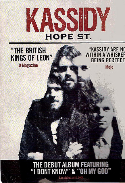
A real published magazine ad for the band "Kassidy" to advertise their new album "Hope St." The ad offers many of the usual conventions, firstly the band name is the first thing you see, written in large and bold font, stands out and attracts the attention of the reader so they remember the name. The second thing we see is probably the large image taking up most of the page it is the same as that used on the album cover and features the band members, which allows people top recognise both the album and the band themselves.
The ad also features two reviews, one from "Mojo" and another from "Q Magazine", which likens then to a well known and well respected similar band by calling them "the British Kings of Leon", by likening Kassidy to this band they may attract the fan base of The Kings of Leon. We also see two songs by the band which will appear on the album and are told a website where we can learn more about them.
Although our album will be of a different genre, many of the conventions and techniques carry over, for example we will also be featuring the artist on our advert so the reader feels they can get to know the artist more and will recognise her easier. Also when we add our quotes they will be from relevant sources. We chose Reggie Yates as he is well known and is much more relevant to the genre than, for example, Tinie Tempah.
Student Digi Pak Analysis

The front cover of this DVD pack has a really nice strong image and it shows what their video was about really well as like the video it has a mixture of animation and real life by putting their animated person inside a location that is 'real'. The front has minimal information on it as it only shows the name of the artist and album therefore it could add something else, such as record label, at the top as it is very bare.
The back of this Digi pak has all of the information and it is presented clearly however i don't really like it. I think this is because it is set out in a way that doesn't look very natural and it is in blocks of text boxes. Also as the background picture had been made to be dimmed therefore it doesn't stand out, so not to over power the information, however this makes it slightly boring.
Student Magazine Analysis

In this magazine ad you can see the hands throwing the paint and the fact that they are slightly blured shows that they are in movement. You can also see the paint flying through the air and hitting the girl.
This magazine ad has all of the information needed for the audience. It says when and where you can buy, who it is and the name of the album, reviews on it and product information such as the record label and website information.
I think this is a really good magazine ad as it catches you attention and gives you all the information quickly and effectively.
Sunday, 20 November 2011


Friday, 18 November 2011
Conventions of Magazine Advert
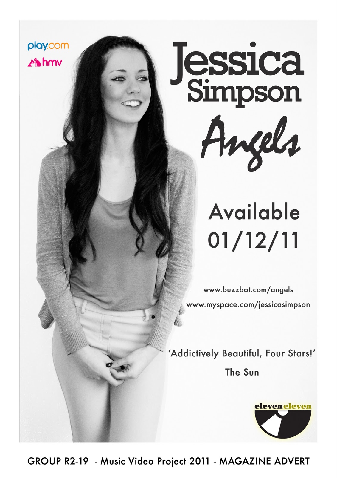
The Name of the Artist - Jessica Simpson
The Name of the Album - Angels
The Release Date - December 1st 2011
Website and Myspace addresses - www.buzzbot.com/angels www.myspace.com/jessicasimpson
Reviews and Ratings of the Album - 'adictively beautiful, four stars!' - the sun
Record Label Branding - Eleveneleven (We chose this because this record label only does cover songs and as Jessica Simpson was already signed to this label)
Thursday, 17 November 2011
Digi Pack Colour Design
Blue and White
This is because it visually links to the top that Holly is wearing in the video and it relates to the sky/heaven.
These are very cool colours as they are not too bright therefore won't take the attention off of Holly but are strong enough colours not to be boring.

This is because it visually links to the top that Holly is wearing in the video and it relates to the sky/heaven.
These are very cool colours as they are not too bright therefore won't take the attention off of Holly but are strong enough colours not to be boring.

Planning for Digi Pack Photo Shoot
Date: Monday 21st November
Location: Michaela's House
Time: 4.00 - 7.00
Ideas:
- Using a slow shutter speed to capture a drawn light around the person as if they are wings.
- Standing in front of the church light shining onto the church.
Date: Wednesday 23rd November
Location: Cambridge Town
Time: 12.20- 2:40
Ideas:
- Sitting on a bench with a slow shutter speed to show people walking past.
- Standing in the street with cars driving past on sow shutter speed.
Digipack Theme
Our theme from our video are Angels and Angel wings. Here are screen grabs from our video showing our theme.
These photos show some concepts that we like and might take on to use as our digi pack.


These photos show some concepts that we like and might take on to use as our digi pack.


Sunday, 13 November 2011
Conventions of a Digipak
Name of the Artist - Jessica Simpson
Name of the Album - Angels
Track listing - 1) Angels
2)
Name of the Album - Angels
Track listing - 1) Angels
2)
Katy Perry ft Kanye West- E.T
Genre Characteristics- Pop, bright colours, creative and interesting costumes.
Lyrics and Visuals- song is about aliens and the images depict this, illustrative visuals, 'DNA' picture of DNA
Music and visuals- slow music to begin matching a long cut rate as the pace quickens so does the cut rate.the cuts are also to the beat of the music.
Demands of the record Label- Katy perry is given many fancy costumes, and is the main chracter in the narrative, and is shown as an attractive woman to the alien in the video, while kanye is almost an extra rather than a character, however he is depicted in dark sunglasses which is associated with the 'cool' and gangster look.
voyeurism- sinigng into the camera, adressing the audience, kanye west is shown looking at floating screens, this is an example of screens with in screens. there is also alot of flesh on show with Katy's outfits, which could be seen as a sexual nature, which is an example of voyuerism.
Intertextual reference- 'where in the world' by midge williams, is played at the begining of the video, there are also clips shown from nature documentaries.

Friday, 11 November 2011
Editing
When watching our music video back when we were close to finishing our editing we thought that the stop motion clips didn't really fit into the rest of the video, so unfortunately we took them out. although we think they were effective, they did not add anything to the video, unlike the artist shots.
The original clips aren't this colour, however during uploading onto blogger they have become different colours.
Wednesday, 9 November 2011
problems
We found that when editing we needed to allow a lot of time to render the clips, this set back our editing time. This is because we used stopmotion clips in our video which needed to be rendered straight away and as we used a lot of filters on all of our clips. Every time we moved a clip we had to render the sequence.
 1 hour of rendering

Subscribe to:
Posts (Atom)